No matter what part of Sage X3 software you use most often - Distribution, Manufacturing, Project Management or Accounting - the user interface (UI) is something that’s prevalent across the application. That’s why we want to take a closer look at the UI enhancements in Sage X3 Version 12.
Responsive Design
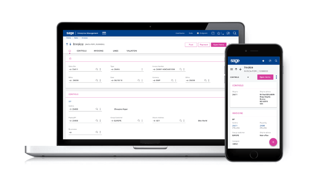
Much of the enhanced user experience in Sage X3 Version 12 is due to the new responsive design framework. The layout of pages now automatically adapt to the size of the device being used, from a smaller mobile device to a larger desktop screen and everything in between.
The responsive design also takes into account the content of a given screen - like the size of the fields, titles and even language being used - to get the best use of the available space. This means that you can now potentially display any classic page on every type of device (in online mode).
The responsive design also takes into account the content of a given screen - like the size of the fields, titles and even language being used - to get the best use of the available space. This means that you can now potentially display any classic page on every type of device (in online mode).
Simplified Navigation
The responsive design also simplifies the navigation by using a very simple right bar with standard actions and additional specific actions at the top of the page.
In addition, navigating from one function to another is now easier and can be done by using any of the following:
In addition, navigating from one function to another is now easier and can be done by using any of the following:
- Your favorites
- Clicking on the breadcrumb when a function is already opened
- Using the site map
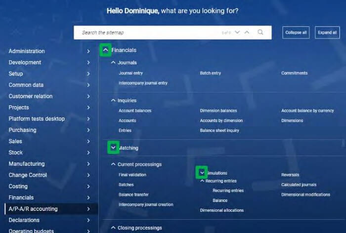
Using the Sitemap to Get Around
The updated site map now opens a whole page, presenting all the menu items available to you. It closes automatically after you choose a link, or when you click again on the compass icon. The following features are available:
- On the left is a list of modules, clicking on a link scrolls the page to the appropriate section.
- Ability to fold/unfold a module, a section, a sub-section.
- Search box to quickly access relevant links.
New Responsive Header
A newly designed header - at the top of every screen - now adapts to the size of the page. The header is where you’ll find links and access to common tasks like the search bar, site map, your favorites, role selection, user panel, date selection and more. These items now rearrange and consolidate automatically, depending on the screen size.
See Also: Introducing Sage X3 Version 12
See Also: Introducing Sage X3 Version 12